Casio is an electronics company established in Japan by Tadao Kashio in 1946. The company became famous by developing the worlds first electric compact calculator and manufacturing electronic keyboards. They created their first brand of watches in 1983 that were extremely popular because of their unique extended features. Casio have created a variety of promotional promotional posters over the years for their watches, most are designed by small graphics companies and freelance designers. I am going to be creating my own promotion posters for the F-91W series of Casio watches.
 |
This is an advertisement poster for Casio, it promotes their summer tour and their new collection of watches. I like how the artist has made the characters in the poster black and white but has coloured in the watches to draw attention to them. I especially like the Casio character which features the watch face as his head. This design has a retro feel to it and some inspiring characters. |
 |
This is another poster from the 'back in the days tour'. It has been created in a similar way to the last using thick black ink and selective colouring to draw attention to the Casio watches on the characters. It features popular fictional characters from different platforms of the media including Donkey Kong, Mario and a severed hand that features in the adams family. They have been portrayed in a criminal line up. This is a fun and unique poster that excites me as you wouldn't associate these character to be in this environment. 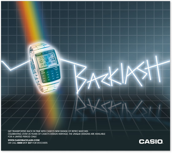 These poster designs have been created by Stephen Kehoe. This poster shows a Casio watch on a checkered background with a rainbow going through it. This creates a colourful feel to the watch although its made from stainless steel it looks attractive with the natural image of a rainbow going through it. The word “backlash” is behind the watch and has a neon sign effect due to the jagged edges and its outer glow. Its also reflected onto the floor which created the effect that it is brightly lit and that the floor is reflective. The text in the bottom left contains persuasive writing to persuade somebody to invest in a Casio whilst the Casio logo is positioned in the bottom right. What i like about this design is how the rainbow is used to bring colour and life to an otherwise boring image, i may use this technique in my final poster design.  This Casio poster also designed by Stephen Kehoe is a similar design to the last poster and shares the same background and writing, although the watch has been changed and the rainbow has been replaced by some kind of Rubix cube. Rubix cubes are generally made up of many colours this is why its able to replace the rainbow and adds excitement and colour to an otherwise plain image. the watch seems to be rising from the cube with rays of colour around it. This is a good design but >I prefer the other design because I feel the rainbow has a more colourful and natural theme than the cube to complement the watch.  This poster has been created by Lobulo designs. What makes this design unique and individual is that everything has been made out of coloured card and then photographed. Lobulo has created this 3 dimensional version of the GA-011 model with is extremely detailed, it even has digital style numbers on the clock. The coloured pyramids in the background behind the watch make the watch stand out and gives a dynamic feel to the poster. This poster first appeals to me from a distance because it looks like a nice bright watch, but on closer inspection it is clear it's been made from card but in great detail and it shows a lot of effort and creativity has gone into making it. Lobulo has created a unique, appealing bold design out of card.  Here are my Casio poster designs that I have created:  I have created my own Casioman for this poster. I started off by drawing the outline of the watch before scanning it to Photoshop and editing it on there. I also added some circles with effects.  This is the poster I created. I took pictures of some watches I owned and put 'be the best' in a digital style to act as a slogan.  My next poster focusses on the watches extended features which makes it weather proof, I created a rhyming slogan and added a cityscape below to appeal to the working class.  I have utilised Casio's logo in this design by linking it together with Casio watches. I have also placed watches on some old paintings and the statue of liberty for comical effect which ties in with the slogan 'stand the test of time' as they are all really old and Casio's were not invented then. But I am making it seem as if they were. |


